如何实现让 CSS Flex 布局最后一行列表左对齐
2024-11-30 23:21:29一. 问题
在CSS Flex布局中,我们通过 justify-content: space-between 属性可以控制列表的水平方向两端对齐。但是,如果最后一行的列表的个数不满行,则就会出现最后一行没有左对齐的问题。如下图所示:

代码如下:
<div id="container">
  <div class="list"></div>
  <div class="list"></div>
  <div class="list"></div>
  <div class="list"></div>
  <div class="list"></div>
  <div class="list"></div>
  <div class="list"></div>
  <div class="list"></div>
  <div class="list"></div>
  <div class="list"></div>
  <div class="list"></div>
  <div class="list"></div>
</div>
<style>
  #container {
    display: flex;
    justify-content: space-between;
    flex-wrap: wrap;
    width: 300px;
    border: 1px solid #000;
  }

  .list {
    width: 55px;
    height: 55px;
    background-color: red;
    margin-bottom: 15px;
  }
</style>
二. 解决方法
1. 列数固定、宽度固定
这里,我们不使用 justify-content: space-between 进行两端对齐。我们需要动态计算每个子元素之间的间隙,通过 margin 属性设置其间隔。比如,在这个项目,元素之间间隙为:calc((100% - 275px) / 4), 275 是由 55 * 5 得到,之后我们设置每个子元素的margin-right,但是在第五个子元素、第十个子元素、....等子元素的 margin-right 为 0。
#container {
  display: flex;
  flex-wrap: wrap;
  width: 300px;
  border: 1px solid #000;
}

.list {
  width: 55px;
  height: 55px;
  background-color: red;
  margin-bottom: 15px;
  margin-right: calc((100% - 275px) / 4);
}

.list:nth-child(5n) {
  margin-right: 0;
}

2. 每一子项宽度不固定
有时候,每一个 flex 子项的宽度都是不固定的,这个时候希望最后一行左对齐该如何实现呢?此时,由于每一行子项列数不确定,这种情况,只能保证左边对齐,右边不会贴边,会有空白,子项目间距由 margin 固定。
这种情况,适配体验不太友好。个人感觉如果使用 justify-content: space-between 在适配体验上会更加不太好,不推荐。
#container {
  display: flex;
  flex-wrap: wrap;
  width: 50%;
  border: 1px solid #000;
}

.list {
  width: 55px;
  height: 55px;
  background-color: red;
  margin-bottom: 15px;
  margin-right: 10px;
}

.list:nth-child(2) {
  width: 65px;
  height: 55px;
}

.list:nth-child(3) {
  width: 35px;
  height: 55px;
}

.list:nth-child(3n) {
  width: 75px;
  height: 55px;
}

3. 每行列数不固定
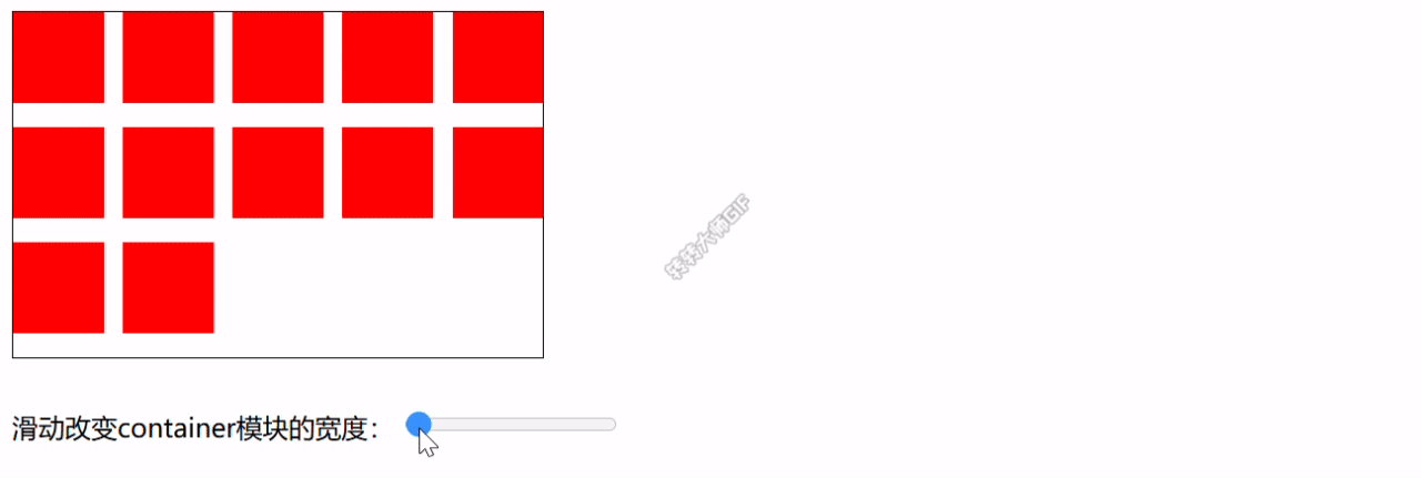
有时每一行的列数是不固定的,这个时候上面的方法就不太适用。下面介绍两种处理方式:
3.1 添加空白元素
最后一行,我们可以使用足够多的占位空白元素来进行占位,占位元素的个数 = 每行放置最多元素 - 已放置元素。由于容器宽度不确定,我们需要对容器元素进行监听,当元素宽度变化时,重新计算空白元素个数。
代码如下:
<style>
  #container {
    display: flex;
    justify-content: space-between;
    flex-wrap: wrap;
    width: 50%;
    border: 1px solid #000;
  }

  .list {
    width: 55px;
    height: 55px;
    background-color: red;
    margin-bottom: 15px;
  }

  i {
    width: 55px;
    height: 55px;
  }
</style>
<script>
const container = document.getElementById("container");

const render = () => {
  if (container) {
    const containerWidth = container.offsetWidth;
    // 每行最多元素个数
    const max = Math.floor(containerWidth / 55);
    // 当前总共多少个元素,此处设为为示例元素个数,当然,你也可以根据情况定义
    const count = 12;
    // 最后一行剩余元素个数
    const remaingCount = count % max;
    // 需要补齐空白元素个数,如果剩余元素个数为0,或者第一行可以放下所有,则不需要补齐空白
    const blankCount = remaingCount === 0 || max >= count ? 0 : max - remaingCount;
    // 删除空白元素
    const childNodes = container.querySelectorAll("#container i");
    childNodes.forEach((child) => {
      container.removeChild(child);
    });
    // 添加空白元素
    for (let i = 0; i < blankCount; i++) {
      container.appendChild(document.createElement("i"));
    }
  }
};

const resizeObserver = new ResizeObserver(() => {
  render();
});

// 监听container元素宽度变化
resizeObserver.observe(container);

// 初始化
render();
</script>
如果需要手动体验,狠狠点击这个demo
3.2 Grid 网格布局
第二种方式,通过 Grid 网格布局,相对简单点。代码如下:
#container {
  display: grid;
  grid-template-columns: repeat(auto-fit, 55px);
  justify-content: space-between;
  width: 50%;
  border: 1px solid #000;
}

.list {
  width: 55px;
  height: 55px;
  background-color: red;
  margin-bottom: 15px;
}
